What Makes A Good Poster

By David A. Barber
Author of Gigging, Everything You Need to Know About Playing Gigs (Except How to Play Your Axe)
Every band that promotes itself (and if yours doesn’t, you’re already wasting your time by reading this), has dealt with the problem of posters. Some bands get lucky and discover an artist who is also a band member, friend or relative who will design cool posters for free or cheap. Many bands, though, struggle with this. Even the one’s who have a professional graphic artist in their midst sometimes lose perspective and put out posters that, while they are cool or like works of art, are completely worthless when it comes to promoting the gig.
That’s the bottom line: The poster’s sole purpose is to promote the gig(s). Don’t forget that. It doesn’t matter how cool the artwork is, if people can’t see it or can’t read the important details, it’s not doing the job.
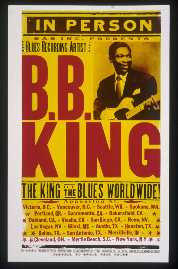
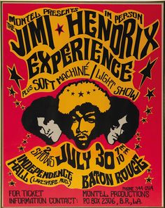
We have a friend who collects old psychedelic era concert posters. They are expensive, the art is terrific and some are very rare. You know, the ones from The Grateful Dead and Janis Joplin from the late 1960s and early 1970s. Did you ever try to read one of them? Even at full size and up close in good lighting, it’s sometimes nearly impossible to read the names of the bands, the venue, and the date. While it’s cool to have those as collectors items now, they were nearly worthless at getting the word out about the gig.
Here’s our rule of thumb: All the information should be easy to read from at least six feet away in a dark smoky bar. If you can’t see the name of the band (or an easily recognized logo), the date and location, what’s point?
Now, sometimes you have to decide where the posters will hang before you can make the call. If they are on telephone poles and you’re hoping drivers will see them, then there’s no point in using any fine print. If they will hang in coffee shops, which are usually well lighted, then maybe you can expect curious patrons to step in closer and read a little more. A short description of the music is a great idea. That way, someone who isn’t already familiar with the band could become interested. Potential new fans want to know what kind of music you play, so even if you have to make something up, put it down. Even something as simple as “Rock” will work most of the time and it’s way better than nothing. If you can’t describe your music, you’ve got bigger problems. (We’ll write an article on that one later) A website address is helpful, too.
When designing a poster, you also need to think about printing. Making full color 11″ x 17″ copies at Kinkos gets expensive pretty fast. So think about what that same poster would look like at 8.5″ x 11″ in black & white or black ink on colored paper. Make sure the design will not be ruined by B&W printing. If you’re gonna send your posters out in electronic format to venues or street teams out of town, you better expect them to be printed in B&W.
Make a general poster: This will save you lots of time and cash in the long run. Make one cool poster design with a big blank white space at the bottom (about 1/4 to 1/3 of the poster) and have 1,000 of them printed up in full color at a professional print shop You can use them for any gig for years. Just don’t put a photo of the band on there unless you’re certain nobody will leave the band before you can use them all up. CD cover artwork is perfect for this.
Don’t be afraid to experiment. Have fun with your poster design and play around with things. Just remember what it’s for and it’ll be that much more effective.
 Previous Post
 Next Post